Data Analytics
Multi-Data Set Image Analysis in Taggit
Combining Taggit analysis results with external data sets to do further analysis on image files
Fred Haan – Calvin University
Key Words: Taggit, QGIS, NWS Damage Assessment Toolkit (DAT), image tagging
Resources
The example makes use of the following DesignSafe resources:
The example also makes use of the following National Weather Service resource, the Damage Assessment Toolkit:
Description
This use case demonstrates how to combine grouping and tagging work that you’ve previously done in Taggit with external data sources to do further analysis. In this case, the National Weather Service Damage Assessment Toolkit (DAT) is used as a source of wind speed estimates that are combined with Taggit results to estimate wind speeds that caused the damage indicated in various image files. NOTE: You always start a Map/Gallery file in HazMapper. HazMapper and Taggit should be considered different ways of viewing the same set of images. You see a thumbnail Gallery of those images when you use Taggit, and you see a Map of those images when you use HazMapper, but it is the same *.hazmapper file in both cases.
Implementation
Taggit enables you to organize images into groups and to tag images. These groups and tags can be used in numerous ways for analysis, and in this document one particular example will be illustrated. In this case, we will combine groupings of images from Taggit with an external data set on a QGIS map to estimate the wind speed that was required to cause a particular type of damage. The external data set will be wind speed estimates from the U.S. National Weather Service.
Gathering the Necessary Data Files
For this example, we will consider a case of a water tower that collapsed during the 10 December 2021 tornado in Mayfield, Kentucky. Numerous photos were taken of this collapsed debris of the water tower including photos of measurements of the structural components on the ground. Using Taggit, these photos were organized into a Group called “Measurements.” NOTE: These photos were grouped according to the instructions in the documentation file Grouping and Tagging Image Files. See that document if you do not know how to group and tag images with Taggit.
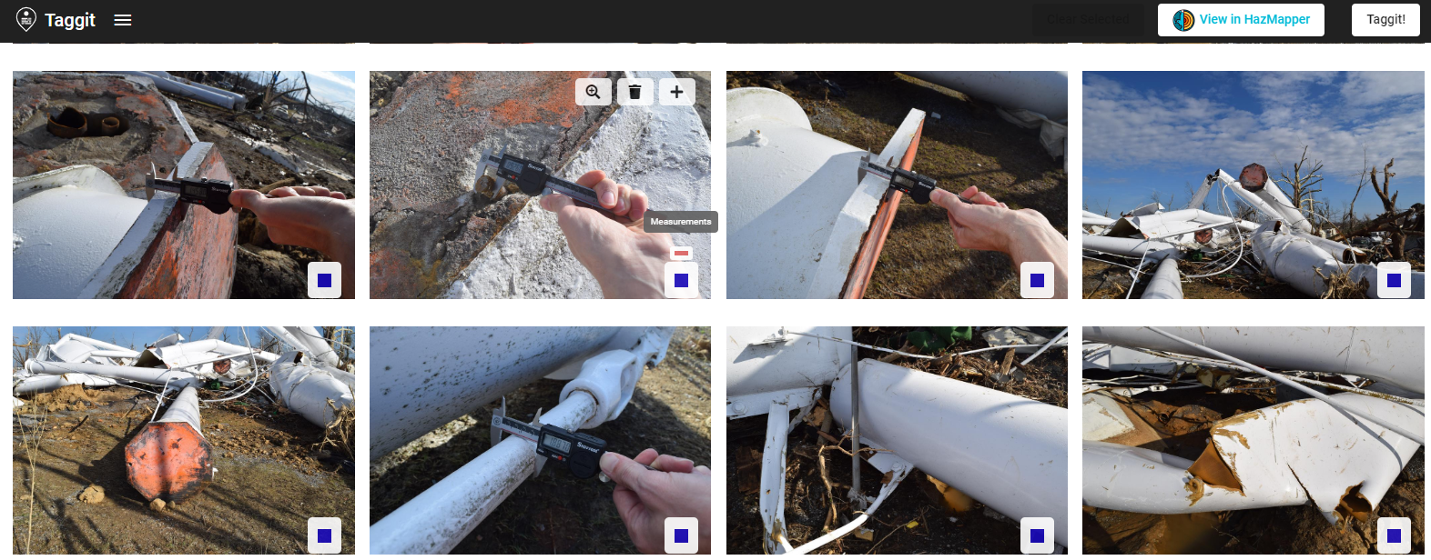
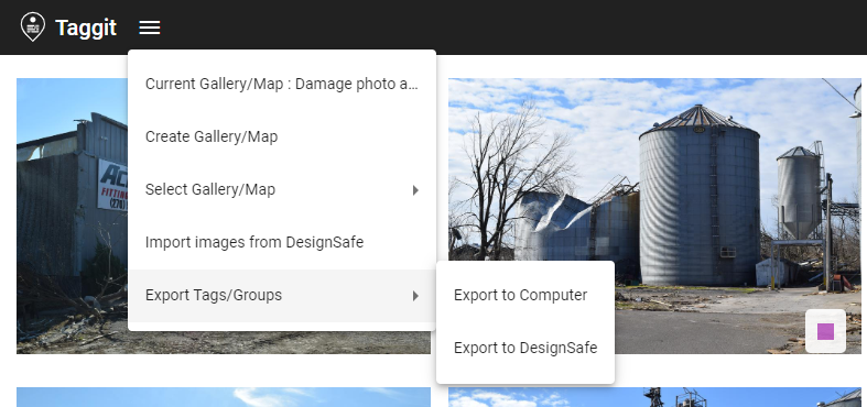
The Export Tags/Groups function in Taggit (see below) will generate json and csv files that contain all the groups and tags you have done with Taggit. The csv files can be used to generate points on a QGIS map.
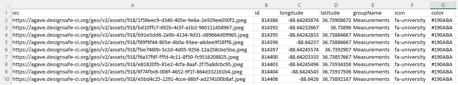
The csv files that Taggit generates look like what is shown below. In this case, the csv file contains all the photos that were included in the group called “Measurements.”
The U.S. National Weather Service (NWS) maintains a database called the Damage Assessment Toolkit that contains data collected from all damage-producing wind storms in the U.S. (https://apps.dat.noaa.gov/StormDamage/DamageViewer). The database has instructions for how to search for a particular event. In this case, the Mayfield, Kentucky tornado of 10 December 2021. Shapefile data can then be downloaded that contains point wind speed estimates that come from damage surveys done after the tornado. In the next section, this shapefile data will be plotted in QGIS along with the Taggit data.
Plotting Data Sets in QGIS
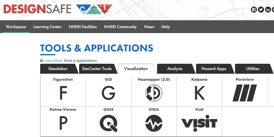
QGIS is used in this example both to demonstrate how it works and to show how nicely it displays the NWS wind speed estimates. Launch QGIS from the Visualization tab of the DesignSafe Tools & Applications menu. Select QGIS Desktop 3.16.
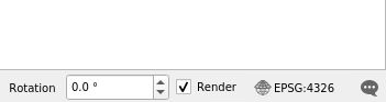
A full tutorial on the use of QGIS is beyond the scope of this document, but to be clear on how this example was done the initial setup of the map is explained in what follows. The coordinate reference system (CRS) can be found in the lower right corner as shown below. If you click there, you can confirm that the standard CRS of WGS 84 with Authority ID ESPG: 4326 was used. This is adequate for most projects.
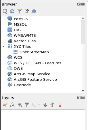
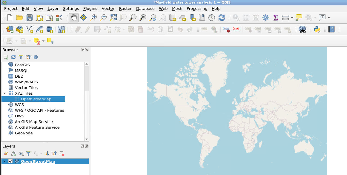
We can add a base map by double-clicking on OpenStreetMap as shown here:
This displays a map and lists the OpenStreetMap in the Layers list on the lower left:
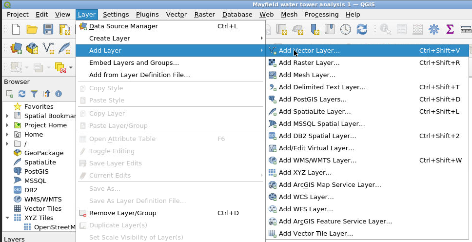
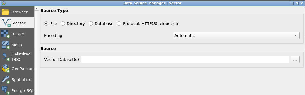
The shapefile data from the NWS DAT can then be loaded by selecting Layer, Add Layer, Add Vector Layer as shown below.
Click on the … symbol to select your DAT output files (which can be an entire zip file), click Add, then click Close. NOTE: your DAT output files will need to be in DesignSafe either in your MyData or in a Project you have access to.
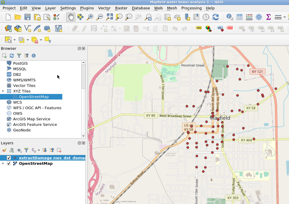
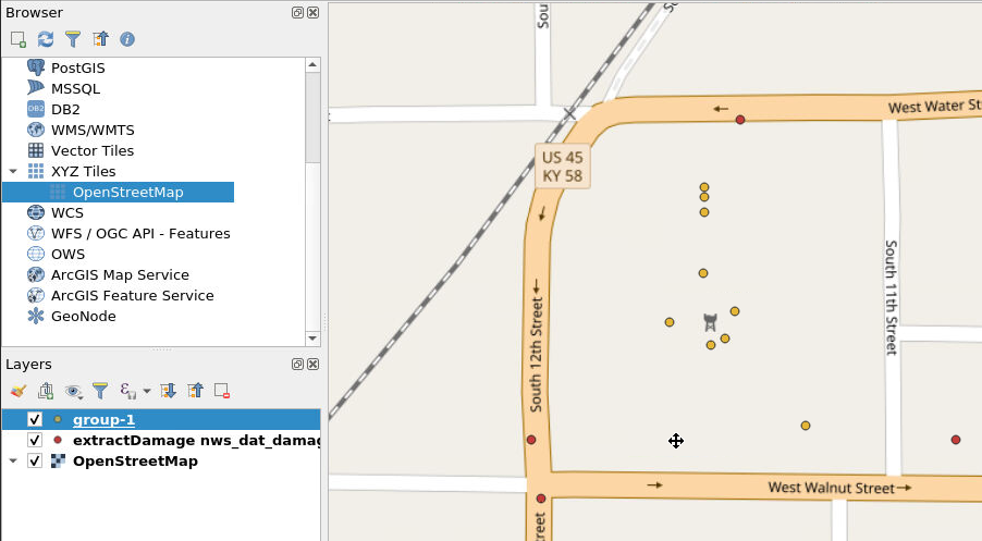
Zoom in on the portion of the map we’re interested in. For our example, we zoom in on Mayfield, Kentucky. Notice the “nws_dat” layer has been added to the Layers list.
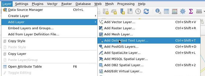
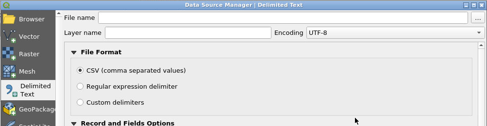
Now we will load the csv data that we generated with Taggit. Select the csv file that corresponds to the “Measurements” group mentioned earlier by selecting Layer, Add Layer, Add Delimited Text Layer.
As before, click on the … symbol and select the csv file, click Add, then click Close.
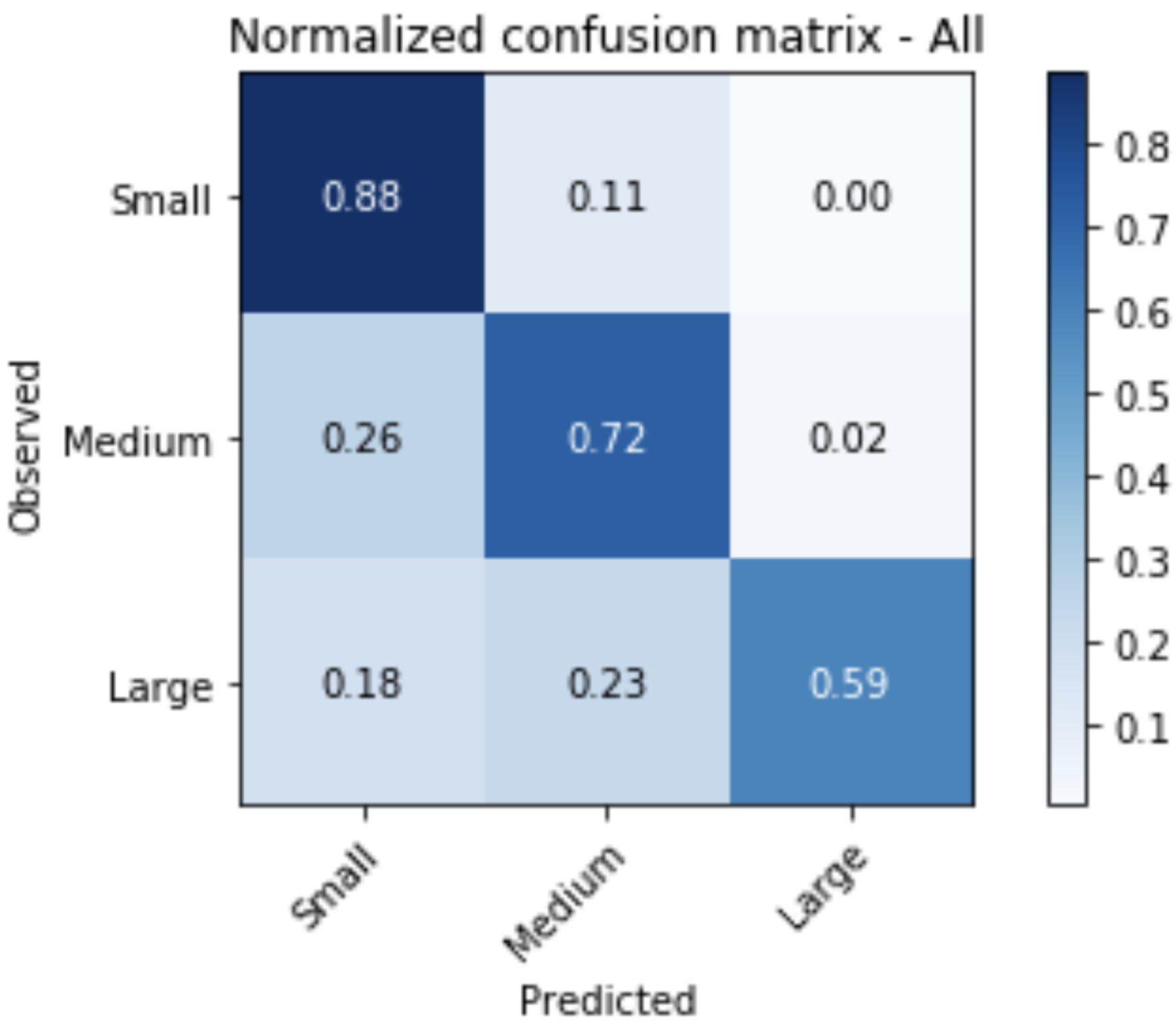
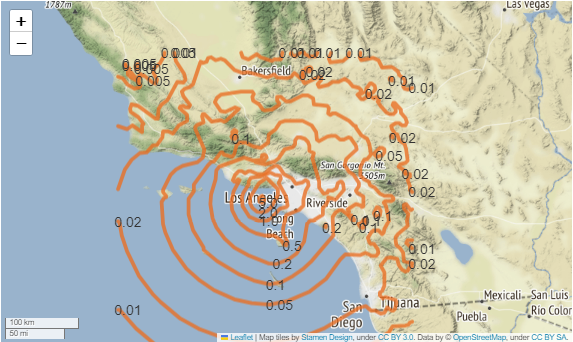
Now we can zoom in on the location where these new Taggit symbols appeared (see below). The Taggit symbols are the layer shown here as “group-1.” On the map, the red points are from the NWS database, and the yellow points are from the Taggit data.
To see the wind speeds from the NWS DAT data, select the nws_dat layer from the Layer list and select the Identify Features button from the icons across the top (see red arrows below). Once you have selected these, you can then click on any of the NWS DAT points and see the metadata for that point. The metadata includes a wind speed estimate (see the black arrows below).
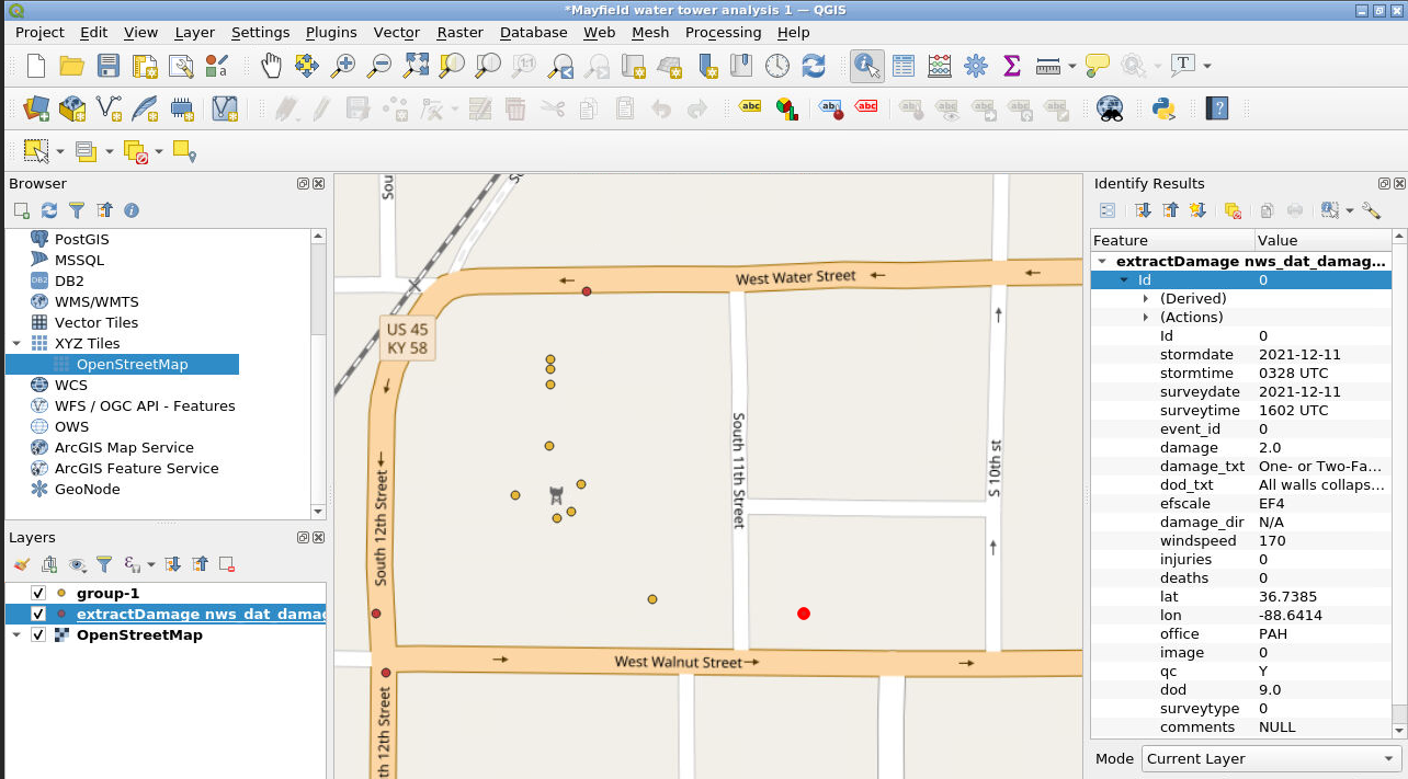
In this example, the NWS wind speeds were found to be 170 mph to the southeast, 155 mph to the southwest, and 135 mph to the north. This gives a researcher a good idea of the range of wind speeds that the water tower experienced during the passage of the tornado. This example represents just one way that Taggit image analysis data can be combined with other data sets to conduct data re-use and research.
Citations and Licensing
- Please cite Kijewski-Correa et al. (2021) to acknowledge PRJ-3349 StEER - 10 December 2021 Midwest Tornado Outbreak.
- Please cite NOAA, National Weather Service Damage Assessment Toolkit, https://apps.dat.noaa.gov/StormDamage/DamageViewer.
- Please cite Rathje et al. (2017) to acknowledge the use of DesignSafe resources.
ML and AI
An Example-Based Introduction to Common Machine Learning Approaches
Joseph P. Vantassel and Wenyang Zhang, Texas Advanced Computing Center - The University of Texas at Austin
With the increasing acquisition and sharing of data in the natural hazards community, solutions from data science, in particular machine learning, are increasingly being applied to natural hazard problems. To better equip the natural hazards community to understand and utilize these solution this use case presents an example-based introduction to common machine learning approaches. This use case is not intended to be exhaustive in its coverage of machine learning approaches (as there are many), nor in its coverage of the selected approaches (as they are more complex than can be effectively communicated here), rather, this use case is intended to provide a high-level overview of different approaches to using machine learning to solve data-related problems. The example makes use of the following DesignSafe resources:
Jupyter notebooks on DS Juypterhub
Citation and Licensing
-
Please cite Rathje et al. (2017) to acknowledge the use of DesignSafe resources.
-
Please cite Durante and Rathje (2021) to acknowledge the use of any resources for the Random Forest and Neural Networks examples included in this use case.
-
This software is distributed under the GNU General Public License.
Overview of ML examples
This use case is example-based meaning that is its contents have been organized into self-contained examples. These self-contained example are organized by machine learning algorithm. Importantly, the machine learning algorithm applied to the specific example provided here are not the only (or even necessarily the optimal) algorithm for that particular (or related) problem, instead the datasets considered are used merely for example and the algorithm applied is but one of the potentially many reasonable alternatives one could use to solve that particular problem. The focus of these examples is to demonstrate the general procedure for applying that particular machine learning algorithm and does not necessarily indicate that this is the correct or optimal solution.
To run the examples for yourself, first copy the directory for the example you are interested in. You can
do this by following the links below to find the location of the associated notebooks in community data,
selecting the directory of interest (e.g., 0_linear_regression for the linear regression example) you will
need to navigate up one directory to make this selection and then selecting Copy > My Data > Copy Here. You
can then navigate to your My Data and run, explore, and modify the notebooks from your user space. If you do
not make a copy the notebooks will open as read-only and you will not be able to fully explore the examples provided.
Linear Regression
Linear regression seeks to find linear relationships between features in a dataset and an associated set of labels (i.e., real values to be predicted). Linear regression is one of the simplest machine learning algorithms and likely one that many natural hazards researchers will already be familiar with from undergraduate mathematics coursework (e.g., statistics, linear algebra). The example for linear regression presented in this use case shows the process of attempting to predict housing prices from house and neighborhood characteristics. The notebooks cover how to perform basic linear regression using the raw features, combine those features (also called feature crosses) to produce better predictions, use regularization to reduce overfitting, and use learning curves as a diagnostic tool for machine learning problems.
Random Forest
Random forests or random decision forests is an ensemble learning method for classification, regression and other tasks that operates by constructing a multitude of decision trees at training time. For classification tasks, the output of the random forest is the class selected by most trees. For regression tasks, the mean or average prediction of the individual trees is returned. Random decision forests correct for decision trees' habit of overfitting to their training set. Random forests generally outperform decision trees, but their accuracy is lower than gradient boosted trees. However, data characteristics can affect their performance.
Neural Networks
Artificial neural networks (ANNs), usually simply called neural networks (NNs), are computing systems inspired by the biological neural networks that constitute animal brains. An ANN is based on a collection of connected units or nodes called artificial neurons, which loosely model the neurons in a biological brain. Each connection, like the synapses in a biological brain, can transmit a signal to other neurons. An artificial neuron receives a signal then processes it and can signal neurons connected to it. The "signal" at a connection is a real number, and the output of each neuron is computed by some non-linear function of the sum of its inputs. The connections are called edges. Neurons and edges typically have a weight that adjusts as learning proceeds. The weight increases or decreases the strength of the signal at a connection. Neurons may have a threshold such that a signal is sent only if the aggregate signal crosses that threshold. Typically, neurons are aggregated into layers. Different layers may perform different transformations on their inputs. Signals travel from the first layer (the input layer), to the last layer (the output layer), possibly after traversing the layers multiple times.
Artificial Neural Network Example
Convolutional Neural Networks
Convolutional neural networks fall under the deep learning subset of machine learning and are an effective tool for processing and understanding image and image-like data. The convolutional neural network example will show an image classification algorithm for automatically reading hand-written digits. The network will be provided an image of a hand-written digit and predict a label classifying it as a number between 0 and 9. The notebooks will show how to install Keras/TensorFlow, load a standard dataset, pre-process the data for acceptance by the network, design and train a convolutional neural network using Keras/TensorFlow, and visualize correct and incorrect output predictions. For those who have access to graphical processing unit (GPU) computational resources a replica of the main notebook is provided that can run across multiple GPUs on a single machine.
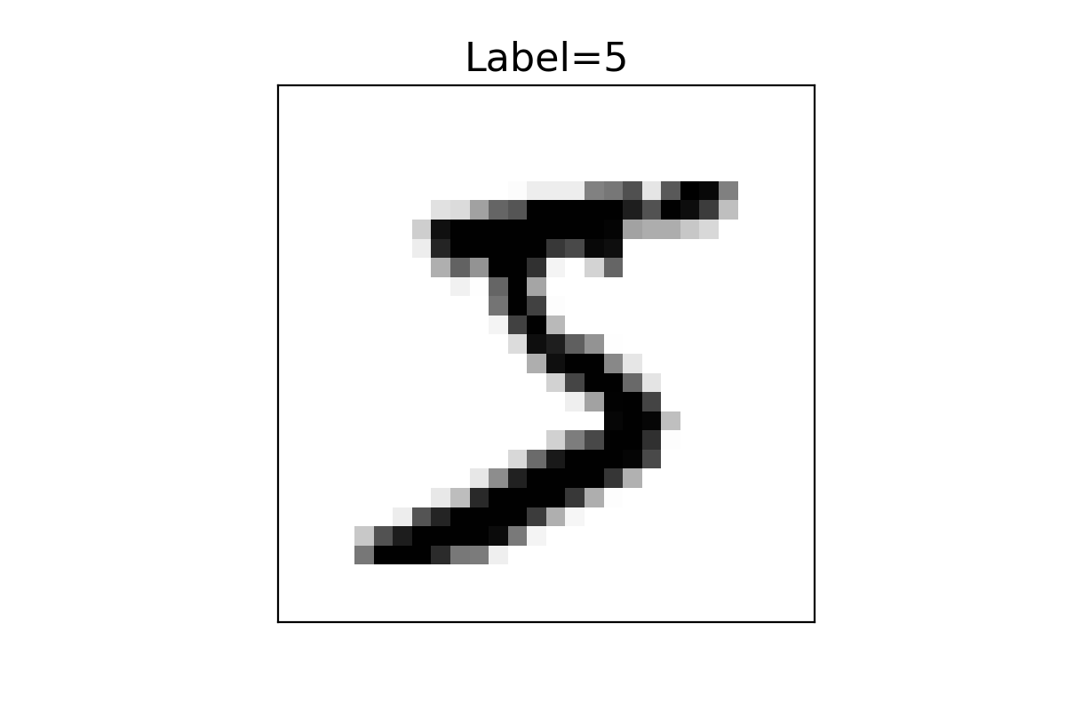
Convolutional Neural Network Example
Application Programming Interfaces
Scott J. Brandenberg and Meera Kota, UCLA
This use case provides some background information on application programming interfaces (API's) followed by examples that utilize the Python requests package to pull data from API's maintained by NASA, the US Census Bureau, the US Geological Survey, and the National Oceanic and Atmospheric Administration.
Key Words: API, Application Programming Interface, Jupyter, Python, requests, US Census, USGS, NASA, NOAA
Resources
| Use Case Name | Packages Used | Link |
|---|---|---|
| NASA astronomy photo of the day | io, json, requests, pillow | |
| US Census map | folium, geopandas, requests, json, getpass | |
| USGS map of recent earthquakes | folium, geopandas, requests, json | |
| USGS Shakemap contours | folium, geopandas, requests, json, pandas | |
| NOAA hourly wind data | folium, matplotlib, requests, json |
Description
What is an API?
An Application Programming Interface (API) is software that enables communication between two components, typically on different computers. For simplicity, we'll refer to a client and a server as the two different software components. Many API's are configured such that the client submits information to the server via a query string at the end of a Uniform Resource Locator (URL). The server receives the URL, parses the query string, runs a script to gather requested information often by querying a relational database, and returns the data to the client in the requested format. Example formats include html, xml, json, or plain text.
A primary benefit of API's is that users can retrieve information from the database using intuitive query string parameters, without requiring users to understand the structure of the database. Furthermore, databases are generally configured to reject connections originating from another computer for security reasons. The API is a middle-layer that allows users to submit a request to the server, but the query itself then originates from the same server that hosts the database.
Authentication, Authorization, Keys, and Tokens
Authentication verifies the identity of a user, generally by entering a username and password, and sometimes through additional measures like multi-factor authentication. When a user authenticates through a website, the server may store information about that user in a manner that persists through the user session.
Authorization determines the access rights extended to a user. For example, a particular user may have access to only their own data when they log in to a website, but they are not permitted to see other users' data.
API's are often stateless, meaning that the server does not store any information about the client session on the server-side. As a result, the request submitted by the client must contain all of the necessary information for the server to verify that the user is authorized to make the request. This is often achieved using keys and/or tokens, which are text strings that are generated by the server and provided to the user. The user must then pass the key or token from the client to the server as part of their request.
API keys are designed to identify the client to the server. In some cases you may need to request a key for a particular API. This often requires you to create an account and authenticate. Generally that key will remain the same and you'll need to include it with your API requests. Note that you typically do not need to authenticate each time a request is made. Simply including the key is adequate.
Tokens are similar to keys in that they are text strings, but they often carry additional information required to authorize the user (i.e., the token bearer). Tokens are often generated when a user authenticates, and set to expire after a specified time period, at which point the user must re-authenticate to obtain a new token.
HTTP Status Codes
By default, the print(r) command above contains information about the HTTP status code, which indicates whether the request was succesful. A successful request will result in a 3-digit HTTP status code beginning with 2 (i.e., 2xx), with "Response [200]" indicating that the request was successful. Status code 1xx means that the request was received but has not yet been processed, 3xx means that the user must take additional action to complete the request, 4xx indicates a client error, and 5xx indicates that the server failed to fulfill a request
More about HTTP status codes: https://en.wikipedia.org/wiki/List_of_HTTP_status_codes
Implementation
The use cases below provide a description of each API followed by code required to run the API, and output produced at the time the documentation was written. The code provided in the documentation has been shortened; a more fully-documented version of the code exists in the Jupyter notebooks, where code is often distributed among multiple cells with annotations prior to each cell. The output presented in the documentation may differ from the output obtained by running one of the notebooks. This is because the notebooks pull live data from an API, and will therefore be different from the data that was pulled at the time the documentation was created.
NASA Astronomy Picture of the Day
![]()
NASA maintains a number of open API's to make NASA data, including imagery, available to the public. Here we focus on the Astronomy Picture of the Day, or APOD. Many of NASA's API's require an API key, which can be obtained by signing up through their form at https://api.nasa.gov/. We have elected to use APOD because a demo key can be used to retrieve photos. Therefore this example will work for users who do not have a NASA API token. Below is an example query.
https://api.nasa.gov/planetary/apod?api_key=DEMO_KEY
If you click on the link above, or paste the URL in your web browser, you will see a JSON string that contains information about the image, including a copyright, date, explanation, hdurl, media_type, service_version, title, and url. The JSON string looks like a Python dictionary, and may easily be converted to one using the Python JSON package. While entering the URL into a web browser returns useful information in the form of the JSON string, it does not actually display the image. Rather, the hdurl or url fields contain links to the image, and users could click these links to view the image. But the real power of the API is unlocked by interacting with it programatically rather than through a browser window.
# Step 1: import packages
import requests
import json
from PIL import Image
from io import BytesIO

# Step 2: Submit API request and assign returned data to a variable called r. We are using DEMO_KEY here for our API key.
# If you have your own API key, you can replace "DEMO_KEY" with your own key here.

r = requests.get('https://api.nasa.gov/planetary/apod?api_key=DEMO_KEY')

# Step 3: Display variable r. If the request was successful, you should see <Response [200]>.
print('HTTP Status Code: ' + str(r) + '\n')
#Step 4: Display the text of variable r. If the request was successful, you should see a JSON string.
if(r.status_code == 200):
    json_string = r.text
else:
    json_string = 'Request was not successful. Status code = ' + str(r.status_code)

# Step 5: Convert the JSON string to a python dictionary using the json package
r_dict = json.loads(r.text)

# Step 6: Extract explanation and hdurl fields from r_dict
title = r_dict['title']
explanation = r_dict['explanation']
url = r_dict['url']
copyright = r_dict['copyright']

# Step 7. Retrieve image using Python requests package and open the image using the PIL Image method
r_img = requests.get(url)
img = Image.open(BytesIO(r_img.content))

# Step 8. Display the image and explanation
print('Title: ' + title + '\n')
print('Copyright: ' + copyright + '\n')
print('url: ' + url + '\n')
img.show()
print('Explanation: ' + explanation + '\n')
HTTP Status Code: Response [200]
Title: IC 4592: The Blue Horsehead Reflection Nebula Copyright: Antoine & Dalia Grelin
url: https://apod.nasa.gov/apod/image/2309/BlueHorse_Grelin_1080.jpg
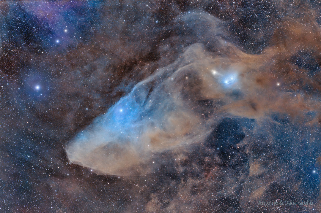
Description: Do you see the horse's head? What you are seeing is not the famous Horsehead nebula toward Orion, but rather a fainter nebula that only takes on a familiar form with deeper imaging. The main part of the here imaged molecular cloud complex is a reflection nebula cataloged as IC 4592. Reflection nebulas are actually made up of very fine dust that normally appears dark but can look quite blue when reflecting the visible light of energetic nearby stars. In this case, the source of much of the reflected light is a star at the eye of the horse. That star is part of Nu Scorpii, one of the brighter star systems toward the constellation of the Scorpion (Scorpius). A second reflection nebula dubbed IC 4601 is visible surrounding two stars above and to the right of the image center.
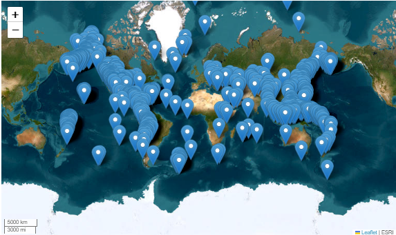
US Census Map
![]()
This use case demonstrates how to pull data from a US Census API request and plot it using Folium. The Jupyter notebook is more heavily annotated and divided into cells. This page presents an abridged version highlighting key details. Details about the US Census API can be found at https://www.census.gov/data/developers/guidance/api-user-guide.html. This use case focuses on the American Community Survey (ACS) https://www.census.gov/programs-surveys/acs, which is a survey conducted by the US Census which details housing and population counts for the nation. A US Census API Key is required to use this use case product. So go over to https://api.census.gov/data/key_signup.html and get your API key now! We'll be here when you get back.
## Import packages and prompt user to enter US Census API key using getpass
import requests
import numpy as np
import pandas as pd
import folium
import json
from tempfile import TemporaryDirectory
import geopandas as gpd
from getpass import getpass
CENSUS_KEY = getpass('Enter Census key: ')
# total population and African American population use Census codes B01001_001E and B02001_003E, respectively
census_variables = ('B01001_001E', 'B02001_003E')
year = 2020
url = (
    f"https://api.census.gov/data/{year}/acs/acs5?get=NAME,{','.join(census_variables)}"
    f"&for=state:*&key={CENSUS_KEY}"
)
response = requests.get(url)
columns = response.json()[0]
pd.set_option('display.max_rows',10)
df = pd.read_json(response.text)
df = pd.DataFrame(response.json()[1:]).rename(columns={0: 'NAME', 1: 'total_pop', 2: 'aa_pop', 3: 'state_id'})
df['total_pop'] = pd.to_numeric(df['total_pop'])
df['aa_pop'] = pd.to_numeric(df['aa_pop'])
df['aa_pct'] = (df['aa_pop'] / df['total_pop'] * 100).round()

with TemporaryDirectory() as temp_dir:
    with open(f"{temp_dir}/states.zip", "wb") as zip_file:
        zip_file.write(shape_zip)

    with open(f"{temp_dir}/states.zip", "rb") as zip_file:
        states_gdf = gpd.read_file(zip_file)
        #states_gdf.rename(columns={5: 'state'})

states_json = states_gdf.merge(df, on="NAME").to_json()
pop_map = folium.Map(tiles= 'Stamen Terrain',height=500)

# Bounds for contiguous US - starting bounds for map
map_bounds = (
    (24.396308, -124.848974), (49.384358, -66.885444)
)
pop_map.fit_bounds(map_bounds)

cp = folium.Choropleth(
    geo_data=states_json,
    name="choropleth",
    data=df,
    columns=["NAME", "aa_pct"],
    key_on="feature.properties.NAME",
    fill_color="YlGn",
    fill_opacity=0.7,
    line_opacity=0.2,
    legend_name=f"Total Percent of African American/Black Population, {year}",
)
tooltip = folium.GeoJsonTooltip(
    fields=['NAME','aa_pct', 'aa_pop', 'total_pop'],
    aliases=['Name: ','African American pop %: ', 'African American Population', 'Total Population'],
)

tooltip.add_to(cp.geojson)
cp.add_to(pop_map)

display(pop_map)

USGS recent earthquake map
![]()
This Jupyter notebook demonstrates the USGS API for retrieving details of earthquakes over a certain magntiude that occured over a specific time period. The goal of this notebook is to take the USGS hourly/weekly/monthly earthquake RSS feed ( https://earthquake.usgs.gov/earthquakes/feed/) and plot the earthquakes and their relevant magnitudes using the Folium Python package(https://python-visualization.github.io/folium/). This API does not require a key.
import requests
import numpy
import json
import pandas as pd
import folium

url = 'https://earthquake.usgs.gov/earthquakes/feed/v1.0/summary/2.5_month.geojson'
r = requests.get(url)
json_data= r.json()

lat1 = []
lon1 = []
captions = []
for earthquake in json_data['features']:
    lat,lon,depth= earthquake['geometry']['coordinates']
    longitude=(lon)
    latitude = (lat)
    lat1.append(lat)
    lon1.append(lon)
    labelmarkers= earthquake['properties']['title']
    names=(labelmarkers)
    captions.append(names)

mapinfo_list  = list (zip(lat1,lon1, captions))

df = pd.DataFrame(mapinfo_list,columns =['latitude','longitude','title'])

title_html = '''
     <head><style> html { overflow-y: hidden; } </style></head>
     '''
my_map=folium.Map(zoom_start=10, control_scale=True,tiles= 'https://server.arcgisonline.com/ArcGIS/rest/services/World_Imagery/MapServer/tile/{z}/{y}/{x}',
                        attr='ESRI')
for index, location_info in df.iterrows():
    folium.Marker([location_info["longitude"], location_info["latitude"]],popup=location_info["title"], color ='purple').add_to(my_map)
my_map.get_root().html.add_child(folium.Element(title_html))

my_map
USGS Shakemap contours
![]()
This Jupyter notebook will walk through how to access an USGS Shakemap API. The goal of this example is to use an API request to retrieve a USGS Shakemap (https://earthquake.usgs.gov/data/shakemap/) and plot the shakemap for the earthquake using a Python Package called Folium (https://python-visualization.github.io/folium/)
import requests
import numpy as np
import json
import pandas as pd
import folium
from folium.features import DivIcon

url = 'https://earthquake.usgs.gov/product/shakemap/40161279/ci/1675464767472/download/cont_pga.json'
r = requests.get(url)
json_data= r.json()

m=folium.Map(locations=[40.525,-124.423],zoom_start=25,control_scale=True,tiles= 'Stamen Terrain',
                        attr='ESRI')

# Bounds for contiguous US - starting bounds for map
map_bounds = (
    (35.87036874083626, -120.7759234053426), (32.560670391680134, -115.87929177039352)
)
m.fit_bounds(map_bounds)

for feature in json_data['features']:

    pga = feature['properties']['value']

    for shape_data in feature['geometry']['coordinates']:
        shape = np.flip(np.array(shape_data).reshape(-1, 2), (0, 1))
        folium.PolyLine(shape,color='#E97025',weight=5, opacity=0.8).add_to(m)

        first_point = shape[0]

        folium.map.Marker(first_point,
          icon=DivIcon(
              icon_size=(30,30),
              icon_anchor=(5,14),
              html=f'<div style="font-size: 14pt">%s</div>' % str(pga),
          )
         ).add_to(m)
m
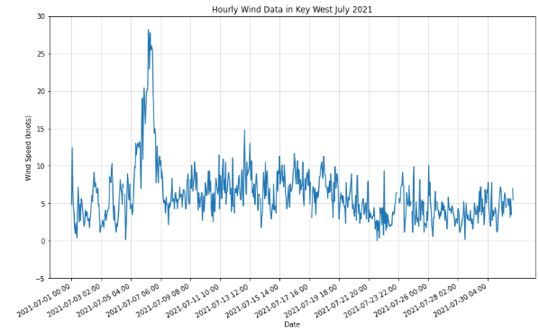
NOAA hourly wind data
![]()
The following use case will detail data from the NOAA Co-OPS Data Retrieval API. You can learn more information here :https://api.tidesandcurrents.noaa.gov/api/prod/. Data regarding tidal/water levels, wind data, temperature data, air temperature/pressure, conductivity, visibility, humidity, and salinity are available. The locations where data is availble is based on buoy and instrumentation location. Predictions as well as reviewed NOAA data is available to users.
import requests
import numpy as np
import pandas as pd
import folium
import json
import matplotlib.pyplot as plt
from pandas import json_normalize

url = ("https://api.tidesandcurrents.noaa.gov/api/prod/datagetter?begin_date=20210701&end_date=20210731&station=8724580&product=wind&time_zone=lst_ldt&interval=h&units=english&application=DataAPI_Sample&format=json")

r = requests.get(url)
json_data= r.json()
data = json_data['data']
df = json_normalize(data)
df["s"] = pd.to_numeric(df["s"], downcast="float")

fig, ax = plt.subplots()
FL =ax.plot(df["t"], df["s"], label= 'Windspeed (knots)')
ax.set_xticks(ax.get_xticks()[::50])
ax.set_yticks(ax.get_yticks()[::])
fig.autofmt_xdate()
fig.set_size_inches(13, 8)
ax.set_title("Hourly Wind Data in Key West July 2021")
ax.set_xlabel("Date")
ax.set_ylabel("Wind Speed (knots)")
ax.grid(True,alpha=0.5)
Citations and Licensing
- Please cite Rathje et al. (2017) to acknowledge use of DesignSafe resources.
- This software is distributed under the MIT License.